What stayed. What I left behind.
This site keeps a record of how it was made. Every change below comes from the project’s decision notes and version history, with a date, a reason and a source. The discarded directions are part of the story too.
Before and after.
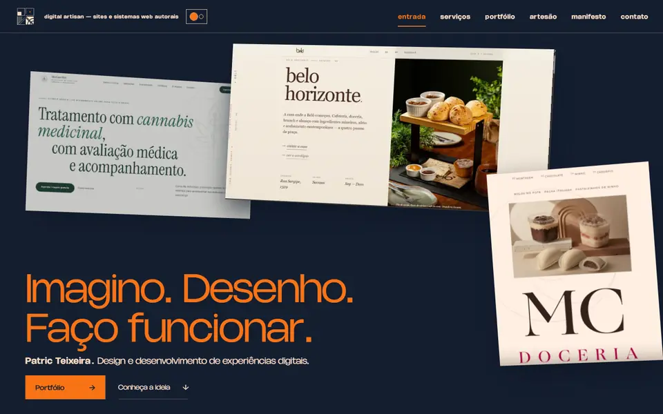
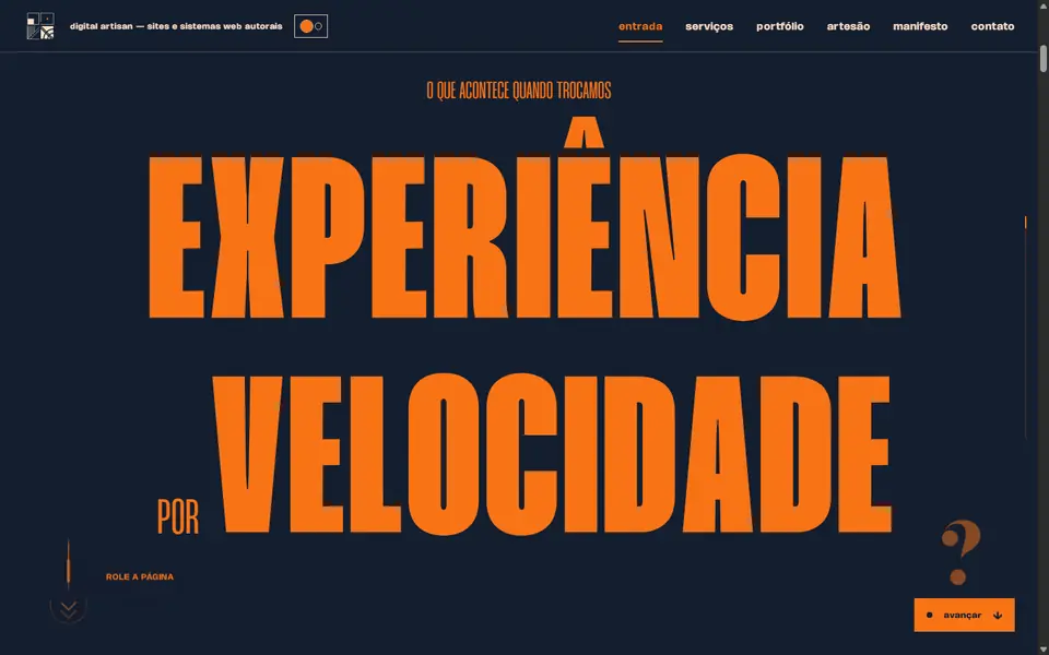
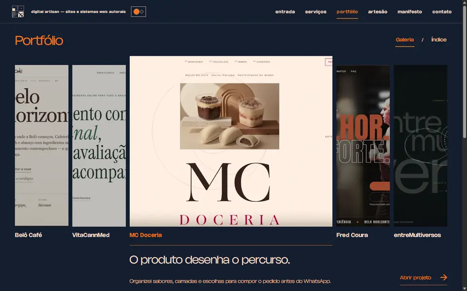
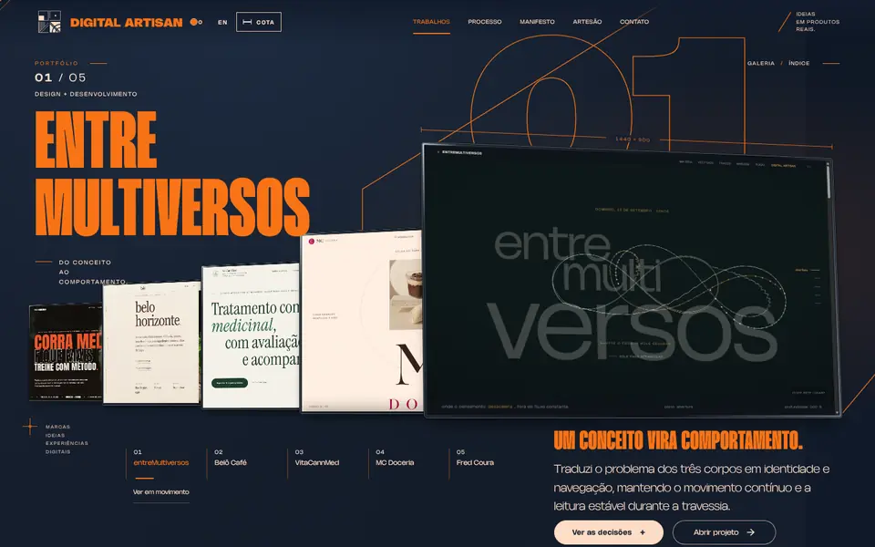
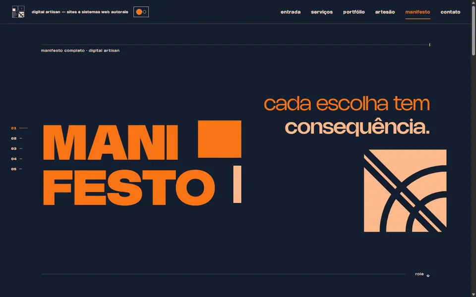
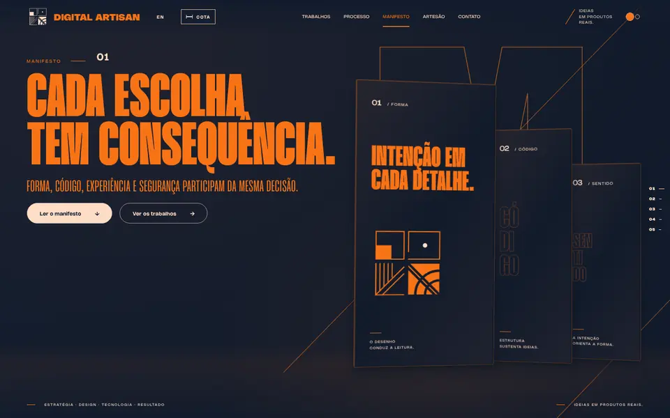
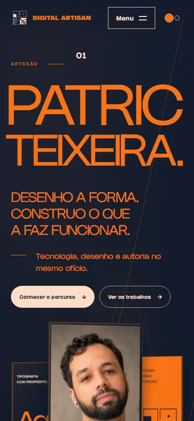
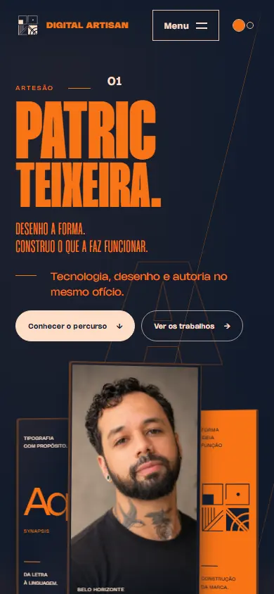
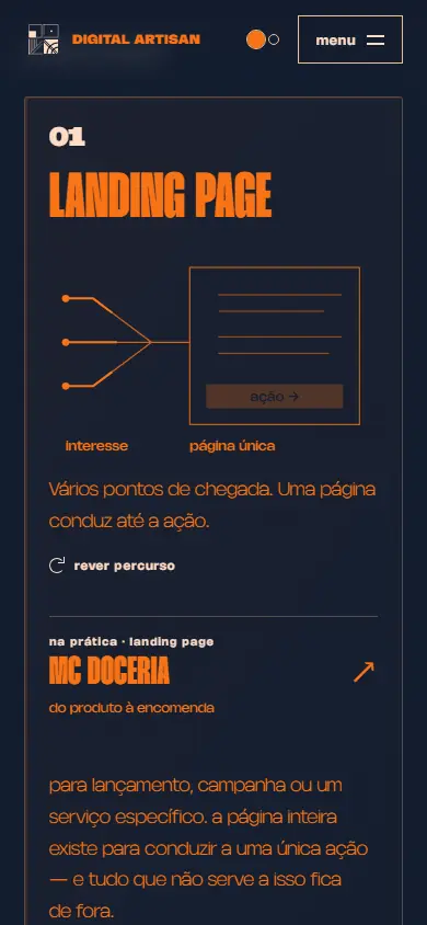
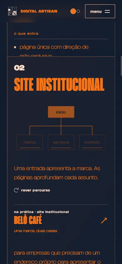
position:sticky and native scrolling. A card only sticks in place once all of its content has moved through the viewport. docs/design/2026-10-06-servicos-cardsThe timeline.
-
The question mark opens the site.
The drawn question mark becomes the opening’s first gesture.
discarded an opening that spent 4.7 seconds drawing the logo before revealing the page. “Two marks appeared in succession… and the only color outside the palette” was on the first screen.
docs/DOCUMENTACAO.md
-
Navigation becomes a floor plan. Contact moves into the footer.
Destinations are arranged like a floor plan, and contact appears at the end of every page.
discarded the navigation table, which “was the most generic part of the site,” and contact hidden behind a button: “a channel behind a toggle is one fewer way to get in touch.”
6cc3824 · 1516cb3
-
The Manifesto panels stop dancing.
The Manifesto composition becomes continuous and stable.
discarded the panels’ choreographed movement. “Geometry is architecture, not ballet.”
dfabcbc · docs/SPEC-manifesto-composicao-continua.md
-
A quieter cursor.
A small diamond that expands over clickable elements. Nothing more.
discarded the crosshair spanning the screen and its coordinate readout, which “competed with the text and showed information nobody had asked for.”
shared/cursor.js
-
Describing the work on its own terms.
Each case study makes only claims its source material supports.
discarded the “business problem → solution” angle, which “invented claims the text did not support,” and direct benefits that “introduced the agency-speak the rest of the site rejects.”
c0027cd · docs/superpowers/specs/2026-08-04-portfolio-lingua-do-cliente-design.md
-
Navy and orange.
The active pages adopt a navy #141E30 and orange palette.
113d5ea · e962488
-
References and the first discarded direction.
The three-body field stays in entreMultiversos, where it belongs.
discarded the portfolio’s orbital field. “The references were applied too conservatively, carrying the personal site’s theme over into the professional one.”
docs/analises/2026-10-05-referencias-portfolio
-
Recalibration.
The original opening returns and the gallery gains depth.
discarded the opening “Imagino. Desenho. Faço funcionar.” and the strip gallery.
docs/design/2026-10-05-recalibracao · docs/design/2026-10-05-folio
-
One visual language.
Manifesto and Artisan use the opening’s spatial language in their own layouts.
discarded the maker’s name stretched to a monumental scale and “PATRIC’S” in the header.
276f512 · docs/design/2026-10-06-entrada-obras
-
The first impression.
Fonts return to standalone files, the opening shrinks from 22.3 to 11.0 screens, and body copy moves away from orange. The first word’s timing stays unchanged: “Showing the word sooner would change the opening’s signature gesture.”
discarded the gallery reflection, made of “five duplicated, flipped and blurred images,” and base64 fonts: “decoding the data URL is as simple as downloading the file.”
63ab450 · docs/analises/2026-10-06-awwwards-p0 · docs/FONTES.md
-
No letter is lost.
Title letters move between pages, with unused letters collected in the type case. Each project takes on the client’s identity. Inspect reveals the page’s construction, the contact form creates a stamp, visitors choose how much motion to use, and the page reports its resource size.
docs/analises/2026-10-07-awwwards-p1-p2
Other things left out.
- Sound. “The site will be silent.” docs/DOCUMENTACAO.md
- A diagonal bar behind the portrait. “A design that needs constant hand-holding can’t stand on its own.” docs/DOCUMENTACAO.md
- A simulated terminal and operating system, suggested by a reference: “There is no reason to bring in fictional files, a terminal or a simulated boot sequence.” docs/analises/2026-10-05-referencias-portfolio
- A thumbnail grid, a conventional hero and a standard carousel. They have been ruled out since the beginning. docs/IDEIAS-DESIGN.md
What was measured.
| metric | before | after |
|---|---|---|
| First Contentful Paint (FCP) | 2.95 s | 1.29 s |
| Largest Contentful Paint (LCP) | 6.02 s | 4.02 s |
| transferred | 1,048 KB | 396 KB |
| screen heights to the first project (1440 px) | 22,3 | 11,0 |
| body copy contrast | 5,95:1 | 12,92:1 |
| misaligned baselines in the Manifesto | 10.56 px | 0 px |
The footer reports the size of the resources this page has loaded.
No letter is lost. Some ideas are left behind — and they’re part of the story too.