VitaCannMed
Clear information about the care process and what comes next.
- My contribution
- Art direction, information architecture and development.
- Delivery
- A medical clinic website that explains the care process and provides routes to appointment booking.
the starting point
How do you make the care process easy to understand?
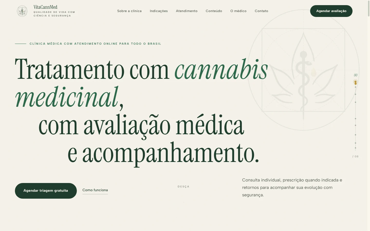
I structured the website for a medical cannabis clinic offering video consultations. It introduces the clinic and doctor, explains the stages of care and makes contact details easy to find.
Visitors can understand the process before getting in touch. Appointment booking links appear in the navigation and at relevant points throughout the page.


01 · structure and interaction
Care, explained step by step.
I broke the process down into screening, consultation, treatment planning and follow-up. Each step has a number, a title and an explanation, making its place in the sequence clear.
The information is broken into clear steps rather than one long paragraph. The image shows how the main heading, step title and explanation work at different levels of the hierarchy.
02 · composition and journey
A distinct visual voice. Clear guidance.
I used a large serif heading for the introduction and smaller type for labels, navigation and practical information. That contrast gives the clinic a distinct identity while keeping essential details easy to read.
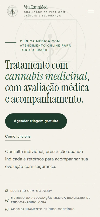
On phones, I preserved that hierarchy and the booking links. The layout adapts to the available width instead of simply scaling the whole page down.
See the site in action.
A recording of the site in use. Play, pause, seek or switch to full screen.
what this project demonstrates
- Information
- Clear sections introducing the clinic, its care process and the doctor.
- Hierarchy
- Distinct type scales for the clinic’s identity, navigation cues and body copy.
- Next steps
- WhatsApp appointment booking built into the visitor’s journey.